|
Help@CSB.DB: The Graphical Validation & Gene Information Page
If you want to get help directly related to a page/query, use the Info Pages / Medium Info Pages. Direct links are available at each (Query) Page.
If you are completely lost, here is link to a short description of what CSB.DB is and is not. Enter this page.
This validation query allows for dynamical validation on demand of discovered co-responses, graphical (bi-) plots as well as more demanding statistic algorithms, such as bootstrap and jack-knife analyses. All algorithms are implemented as R scripts, which can be invoked upon user selection and generate a PDF output. These files can be optionally saved by the user for further reference. Furthermore this additional tool supports the detection of outliers, which may be associated with technical errors of the transcript measurements or with biological variance.
To get information of your choice for the Graphical Validation & Gene Information Page use the links listed below.
- Graph. Page- Overview: A short description of the Graphical Validation & Gene Information Page.
- Graphs & Validation: A description of the available graphs and validation methods which can be invoke upon user selection.
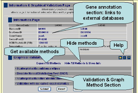
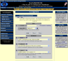
The Graphical Validation & Gene Information Page can be accessed if you click on a particular coefficient values (e.g. blue marked correlation coefficient). After invokation you see the following page.
Here is a picture and a graphic based introduction into the functionality of the Graphical Validation & Gene Information Page.
The gene information section contains information about your gene of interest and a second gene according your selection. If you click on the links, which are marked blue, you enter external, expert databases which provide further information for your selected gene.
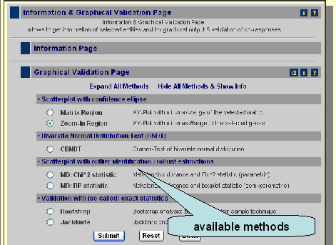
Moreover you can get graphs for the two selected genes as well as validate the correlation with more sophisticated methods like bootstrap. The available methods can be accessed if you click on 'Expand All Methos' or if you click on a sub-category, like Scatterplot with confidence ellipse. If you press submit you get the default methods, which means a scatterplot with confidence ellipse (method: zoom-in region).
Scatterplot with confidence ellipse
Scatterplot with confidence ellipse 
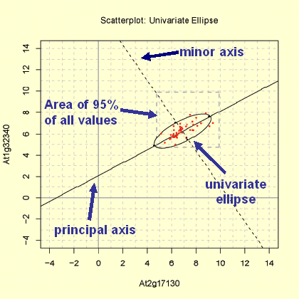
This Scatterplot function provide two methods to produce a graph of the distribution of the variables X and Y: The 'Matrix Region' and the 'Zoom-In Region' function. In both plots the range of x-axis and y-axis differs. Furthermore a univariate ellipse of the distribution of X and Y is shown in the 'Matrix Region' plot, whereas the 95% area of the location of the bivariate mean of X and Y (bivariate ellipse) is given in the 'Zoom-In Region' plot. For both plots the observations are log base 2 transformed, but not range-normalised!
Matrix Region
The 'Matrix Region' method produces a scatterplot in range of the minimum and maximum of log base 2 transformed expression measurements. The area boradered with dashed line represent the area where 95% of the expression measurement of the coresponding matrix were located. The minor and principal axis are plotted (see bottom graph). The principal axis represent the gene with higher variance. Moreover the 95% univariate ellipse is plotted.
Zoom-In Region
The 'Zoom-In Region' method produces a scatterplot in range of the minimum and maximum of log base 2 transformed expression measurements for the two selected genes. The minor and principal axis are plotted (see bottom graph). The principal axis represent the gene with higher variance. Moreover the 95% confidence ellipse is plotted, which represent the area where the bivariate mean of gene X and Y are located with a probability of 95%.
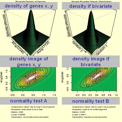
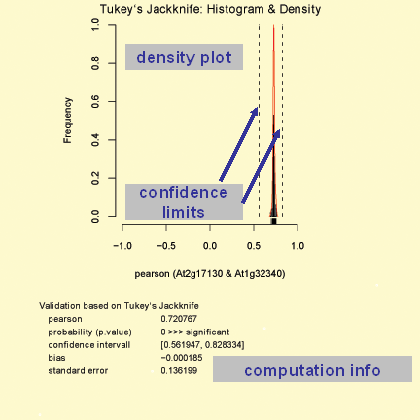
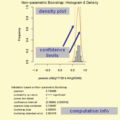
Bivariate Normal Distribution Test (BNDT)
Bivariate Normal Distribution Test (BNDT)
The function 'CBNDT' performs a bivariate normality test for the genes X and Y by usage of the Cramer-test (Baringhaus & Franz, 2004). The output generated consists of various graphs which representing the bivariate density of X and Y (graph: top, left) as well as a normal bivariate density (graph: top, right). Moreover a text output is given of the statistical test applied. For the plots the observations are log base 2 transformed followed by range-normalisation. Therefore the parameters represent those which were used in the co-response analyses. The parameters for the performed tests as well as a short interpretation of the output are given in the below the graph in the generated pdf file.
Scatterplot with outlier identification
Scatterplot with outlier identification
This scatterplot function provide two methods to produce a graph of the observations for the gene X and Y. Moreover outlier, identified by two algorithms, are labelled. For both methods the observations are log base 2 transformed followed by range-normalisation. Therefore the parameters represent those which were used in co-response analyses.
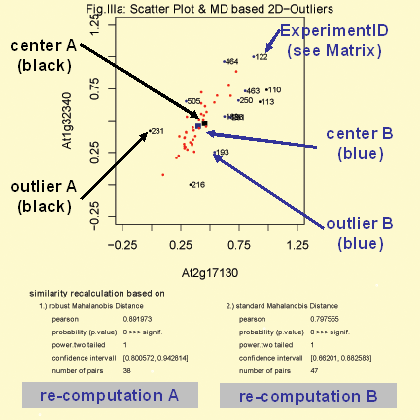
MD:Chi^2 statistic
The function 'MD:Chi^2 statistic' detect bivariate outliers based on the mahalanobis distance. For this function two method are available. Method A (black colored) based on the classical ('standard') Mahalanobis distance. The center (black colored) is simply the mean of the expression values for gene A and B. Outliers defined by this method are labeled black and marked with the co-responding CSB.DB experiment id (see Help: Matrices - Gene Co-Response Analyses). According to the detected outliers the correlation is re-computed (graph: bottom, right). Method B (blue colored) based on the robust Mahalanobis distance. The center (blue colored) is computed based on the 'mve' algorithm which is an robust procedure to estimate the mean and the covariance base on minimal ellipse (Rousseeuw & Leroy, 1987). Outliers defined by this method are labeled blue (and includes the black ones) and marked with the co-responding CSB.DB experiment id (see Help: Matrices - Gene Co-Response Analyses). According to the detected outliers the correlation is re-computed (graph: bottom, left).
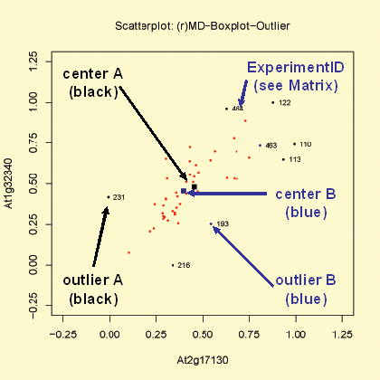
MD:BP statistic
The function 'MD:BP statistic' is similar to the 'MD:Chi^2 statistic' function (see above). Instead to use the chi square (chi^2) based statistic to identify outliers ist used a boxplot approach to detect outliers. Coloring and labeling is identical to the function 'MD:Chi^2 statistic'.
|